Case study · Website & dashboard · 2025–2026
From a one-page brief to a site and a client dashboard
Sonosift (a renamed client) certifies that companies' voice AI complies with regulation; its buyers are compliance officers. The brief was a landing page, but the copy held fifteen pages. As the only designer, I turned it into a site and designed the client dashboard. The site shipped in Webflow in February 2026.

The situation
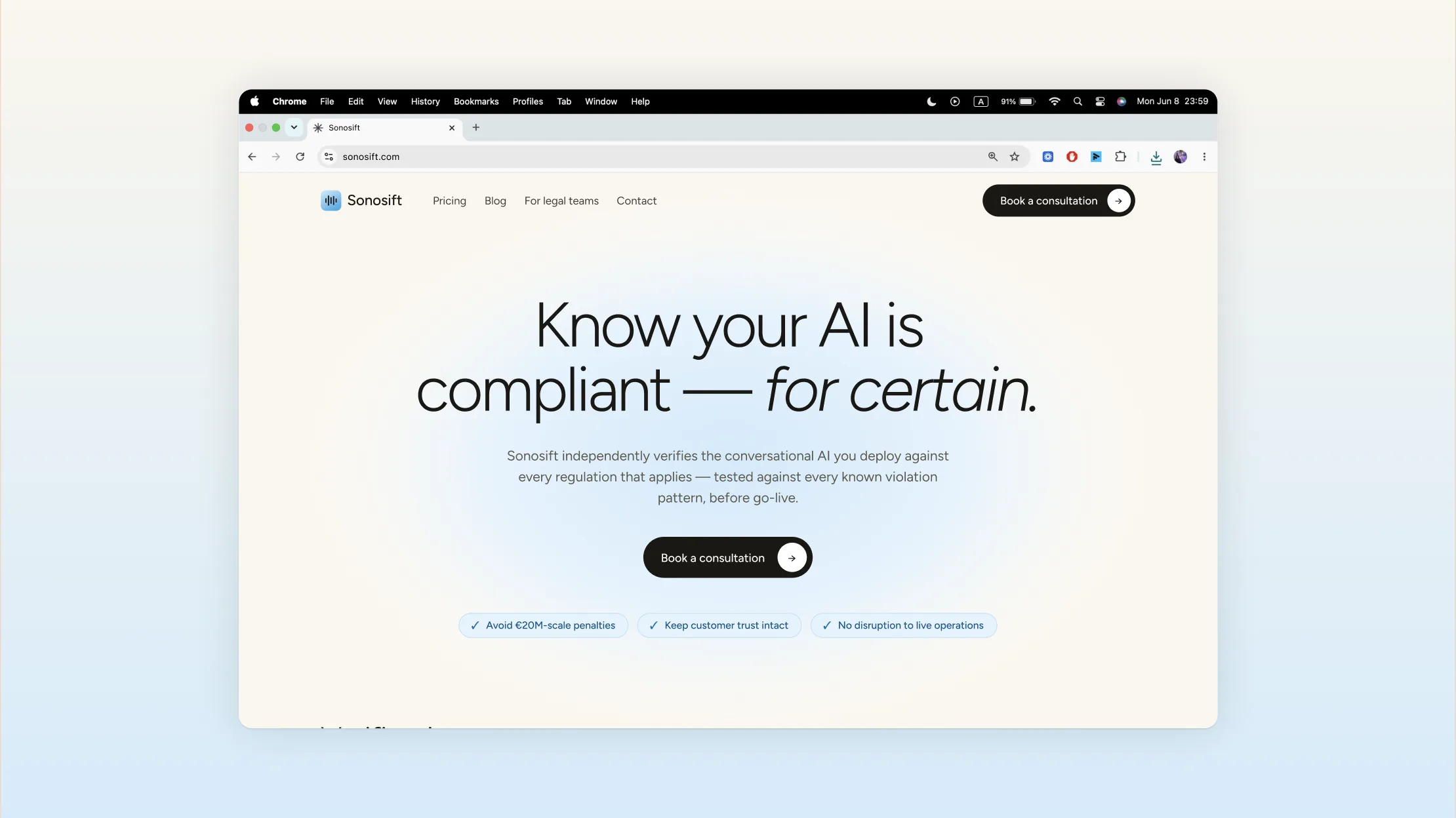
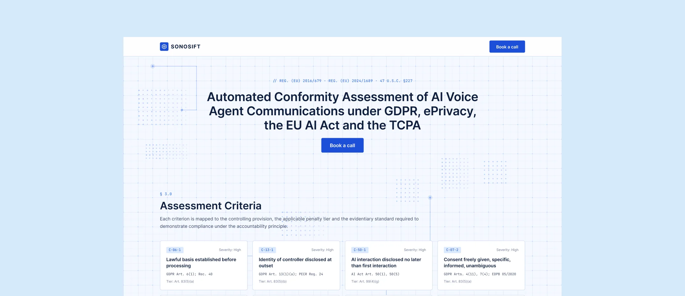
The company was pre-launch, with a few testimonials and no known client logos. Its AI-built site read like a compliance memo: regulatory language, a hero that explained nothing, and no path from risk to solution.
From the second month I also ran all client communication.
Decision
Fifteen pages where the brief said one
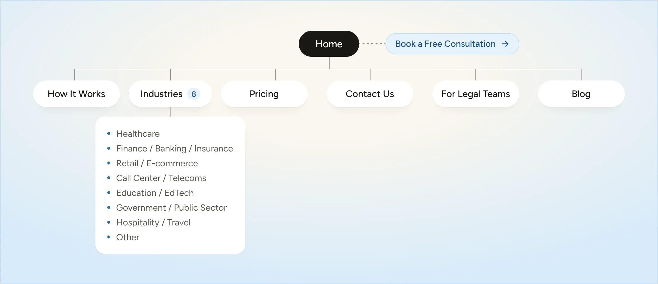
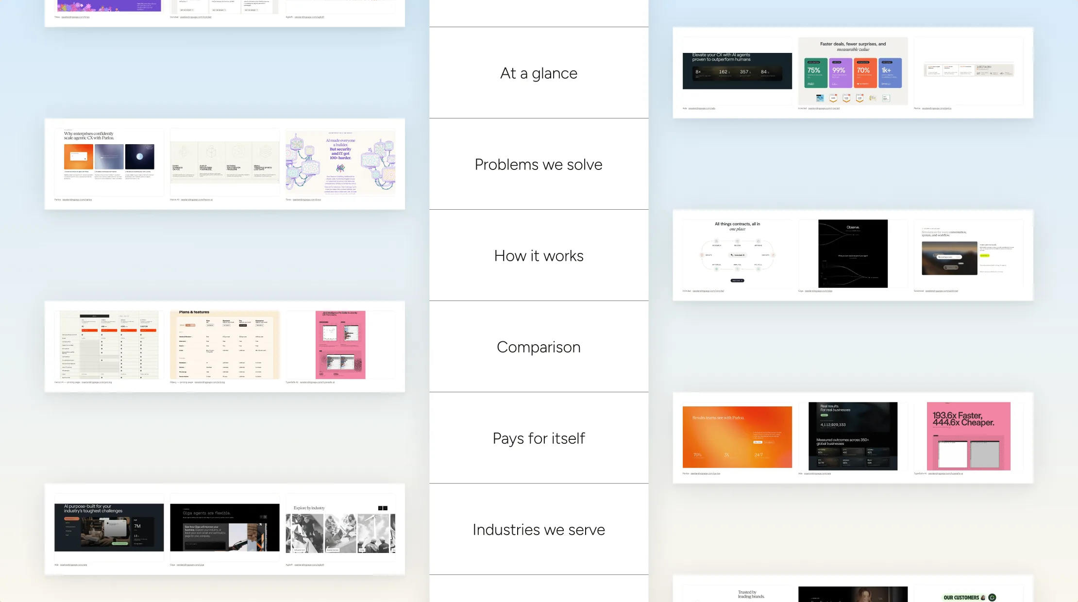
The client and copywriter were already writing when I joined, with no structure underneath. In that copy I found three pages, not one: a landing page, how it works, and industries. The industries copy held a page per sector, so a healthcare buyer wouldn't scroll past six other sectors to reach patient data.
I told the client; she asked me to recommend the rest. I added pricing and contact pages: a company that hides its prices is hard for a compliance officer to trust.
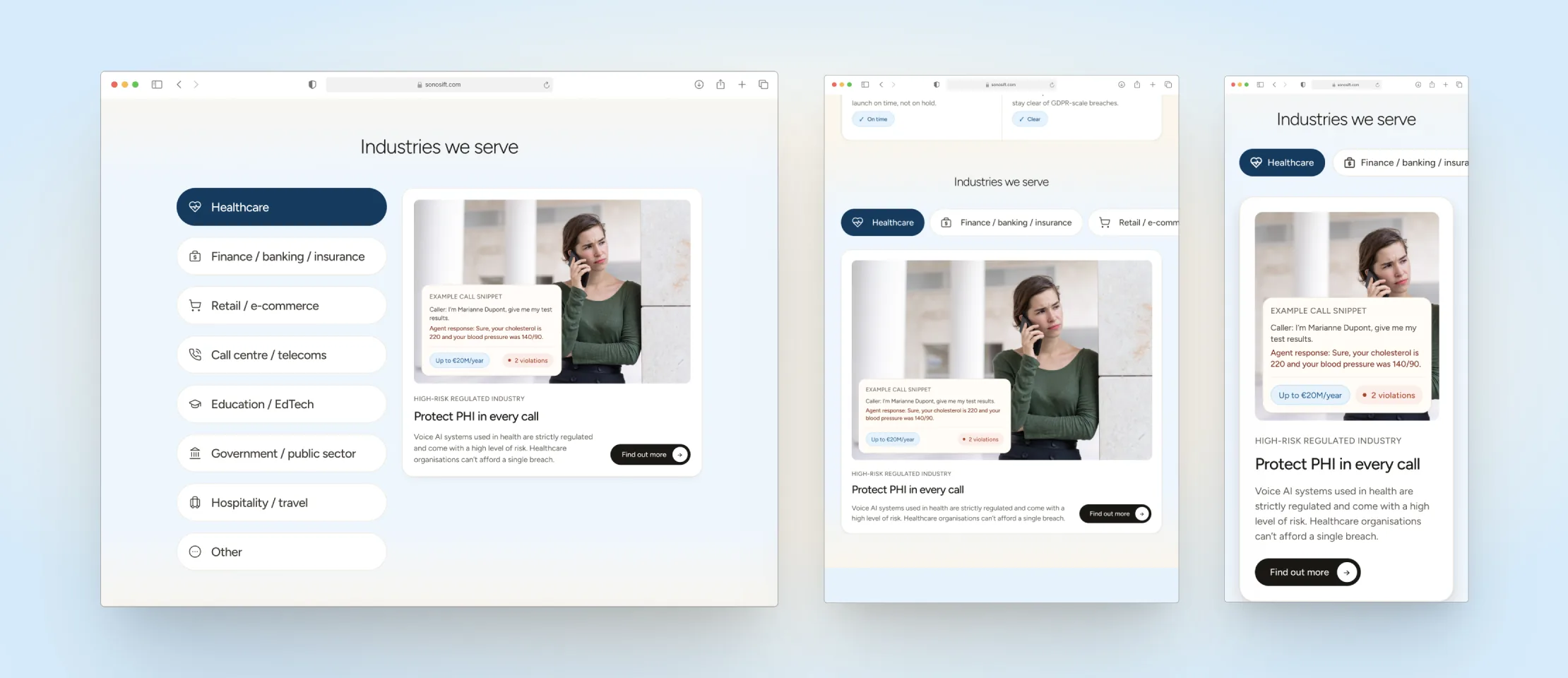
The seven industry pages and an 'Other industries' page share one template; only the regulations, the failure example and the exposure change. That kept eight pages affordable to build, and easy to compare.
The trade-off
One long page was faster, cheaper, and what she asked for. Fifteen took longer, but each audience got a page addressed to it.
Decision
Making a high-stakes subject easy to read
The old site was dense and technical about a subject that already frightens people. The redesign went light: generous whitespace, one idea per section, short lines.
I worked through it section by section with the copywriter; keeping a section short means deciding what it won't say.
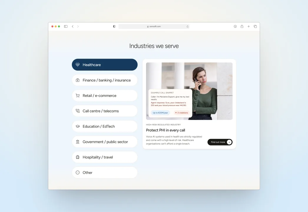
The failure examples carry the weight. Each industry shows a two-line exchange: a caller asks if the call is recorded, and the AI ignores it and asks for an account number. The breached regulation sits underneath. A compliance officer sees the risk in one read.
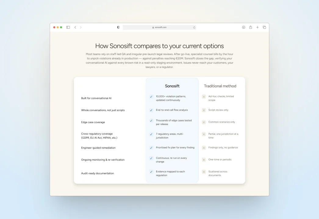
The comparison table is where this broke down. The client wanted brevity everywhere but more detail here, and a dense table works against the site's tone. It took longest, and it's still the heaviest thing on the page.
Decision
The wireframes were costing us the client
The client had always hired freelance designers directly. At the wireframe review there were five of us on the call, and she read the greyboxes as finished design while paying for everyone's time. It didn't land.
I took a separate call with her alone and relayed what she wanted to the team; our founder agreed to change course. Wireframes gave way to a written structure for each page, with a few real examples per section: she chose, the copywriter rewrote to fit. From then on she worked one-to-one with me, so I ran the calls, summaries and coordination alongside the design.
What I rejected
Explaining what wireframes are for and carrying on: she had already decided they were waste she was paying for. Generating them faster with AI wasn't presentable enough yet.
The cost
With no greybox stage, structure and visuals were settled together, losing the cheap round where a section moves for nothing. On an app I'd argue the other way. Running comms on top of design also split my focus for a few weeks.
Decision
Settling a disagreement without either of us winning it
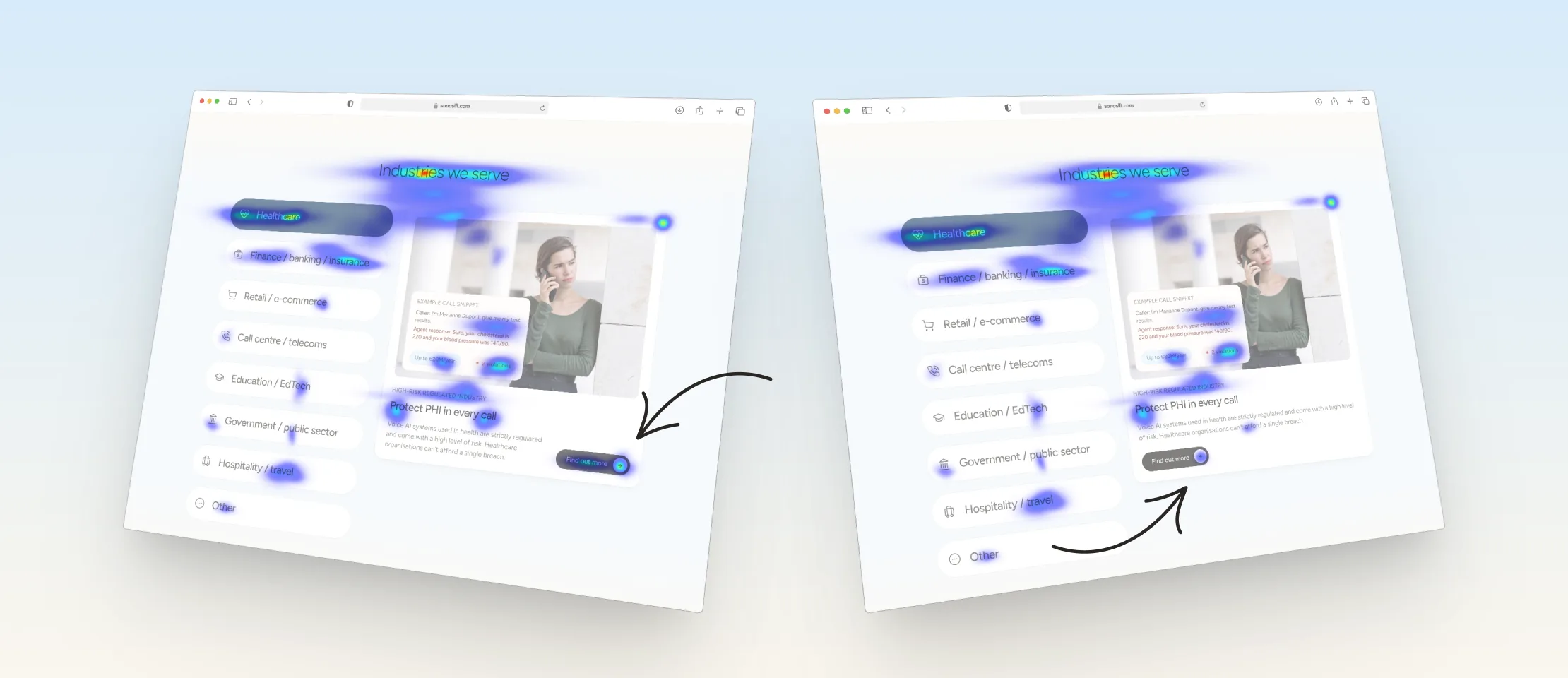
She wanted the call-to-action moved on the industries section. I thought her placement pulled attention off it, but my opinion isn't an argument to a paying client.
I ran both layouts through Clarity's predicted heatmaps; mine held attention on the button. That's a model's guess from a static image, not real behaviour, and I said so. It took half an hour and turned a matter of taste into evidence.
Still open
A live A/B test would have settled it properly, but it would have cost time we didn't have. I never learned whether the prediction held.
Research
The one page I didn't propose
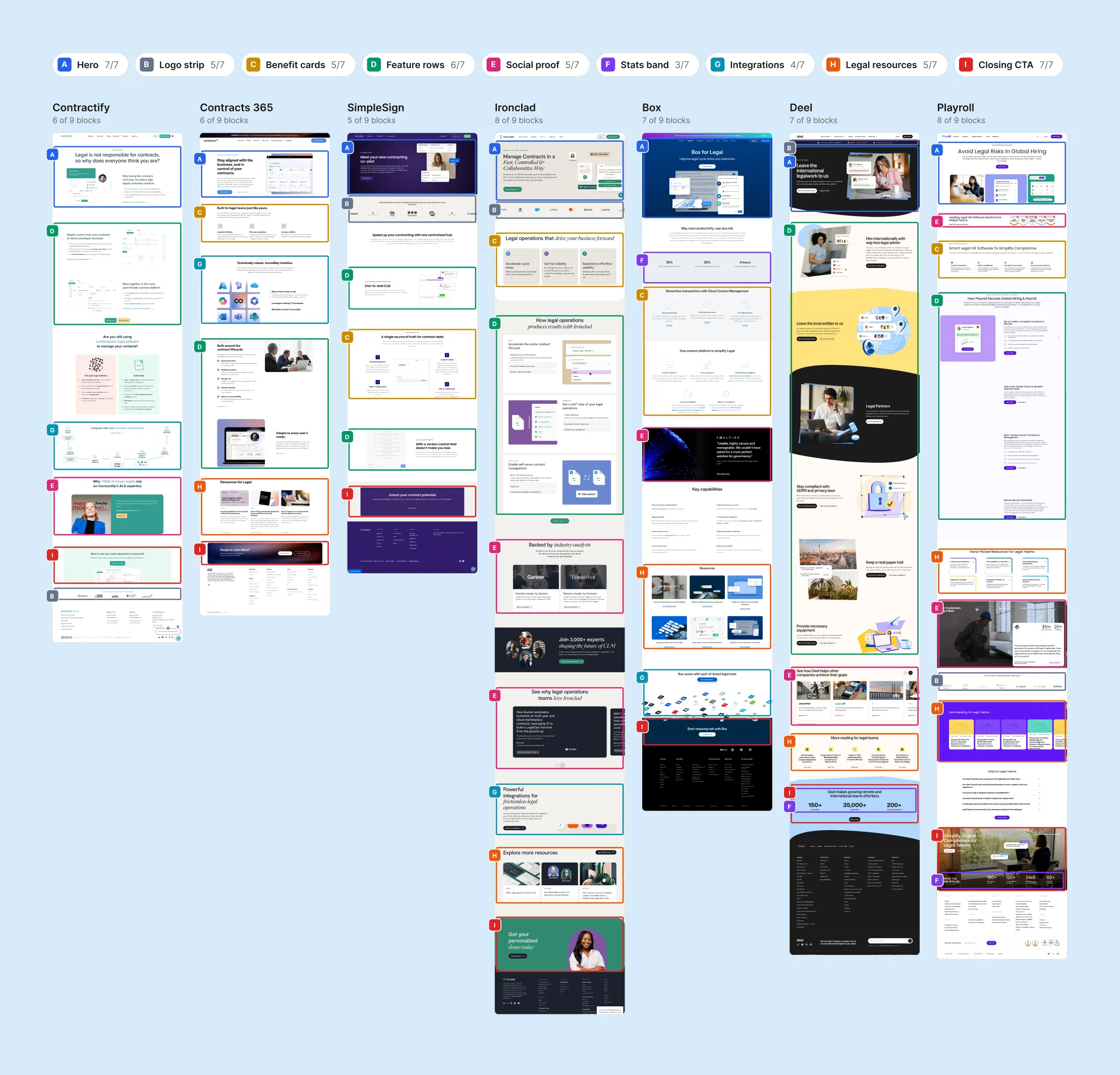
Partway through, the client added a second audience, legal teams, and asked for a page for them. I studied how other companies pitch to lawyers: compliance badges, testimonials from named attorneys, restrained palettes, copy about risk rather than excitement, and a consultation CTA.
The site already met most of it, and I said so. The gap was social proof from named firms, which a pre-launch company doesn't have. The credible substitute was demonstrated expertise, so I recommended a blog.
Decision
A results page modelled on trust centres
The second deliverable showed verification results to Sonosift's own clients. The brief took several calls to pin down; underneath, it was a link-and-password page with status, findings, history and downloads.
I modelled it on trust centres, the pages security and compliance vendors use to publish their own posture, because readers already know the genre:
- Status leads, in plain words. The reader's question is 'are we clear?', so a sentence answers it before any detail, not a score that invites argument about the scale.
- Frameworks separated from local jurisdictions. They're read by different people at different times; a client in four markets scans for their own geography.
- Reports are dated bundles, downloadable whole. Findings go on to auditors and executives, so the unit is the document set, not the screen.
- A monthly archive, not a current state. Audit defence rests on compliance held over time.
Support sits on the page too: the first reaction to a failed check is 'what does this mean for me?', and answering in place beats an email thread.
I prototyped it in Figma Make in about a day, so she could open it from a link and hand it to her own clients.
Still open
It was never built. She was collecting feedback on the prototype when I left.
What happened
The site went live in Webflow in February 2026. The developer said the Figma file was unusually easy to work from.
The client asked for me by name on her next product: a prototype needed within a week. I designed it in a day and a half; once validated, it was built as a full product.
I know I can 100% rely on Nia.
“Very proactive, good communication skill. I know I can 100% rely on Nia for the work which is always the best design quality. I value Nia's proposition and engagement — she thinks further than I do and this helps the project very much. I'd like to work more with Nia in future, she is super talented and very nice to work with. Always a pleasure working with her.”
I left the company in March 2026, before Sonosift's clients responded and without access to analytics. The domain has since expired.
What I'd carry forward
Argue for testing with the people the site addresses. No compliance officer saw it before launch, and none could tell me whether it worked.
The site still lacks case studies. It asks buyers to trust an unknown company, and other customers' stories make that case best; the blog was only a stand-in.
Sonosift · Voice AI compliance certification · Website & client dashboard
Sole designer · Nov 2025 – Mar 2026
Client name and visual identity changed; the work shown is a reworking of the original.