Case study · AI cricket coaching app · 2025–2026
From an investor demo to an app on both stores
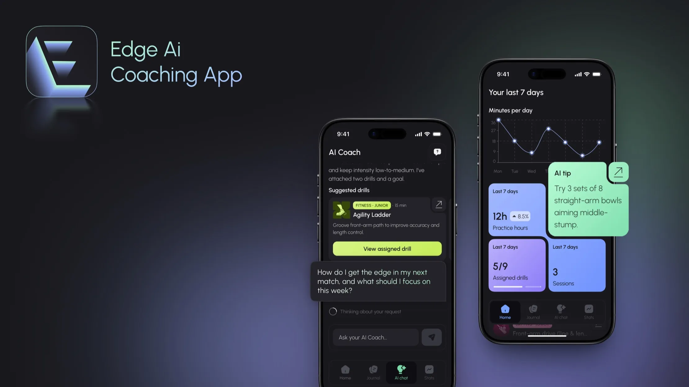
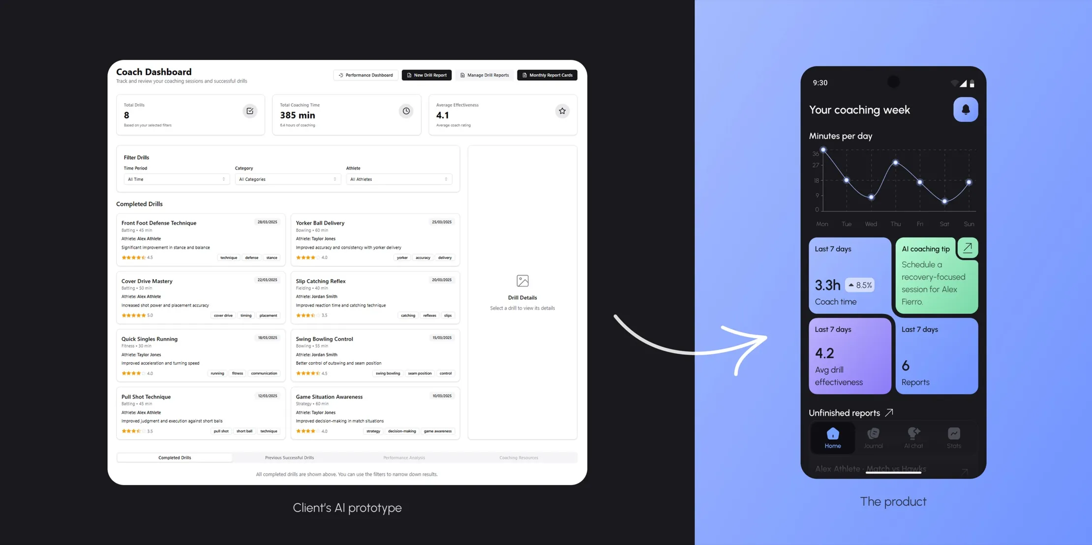
The client, a cricket coach, had raised money on an AI-generated desktop prototype: every feature on a few screens, no flows, no split between athlete and coach. As the only designer, I turned it into a mobile app with two modes. It shipped to the App Store and Google Play.
The situation
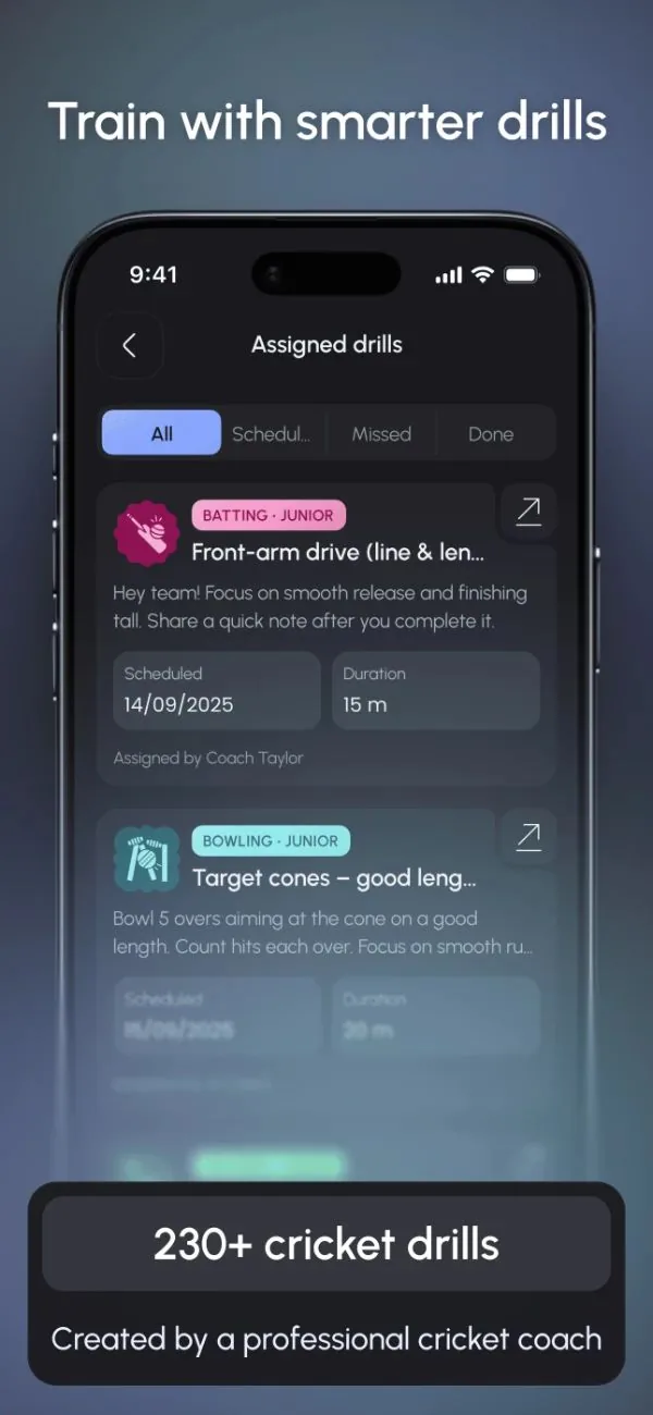
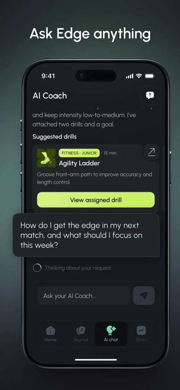
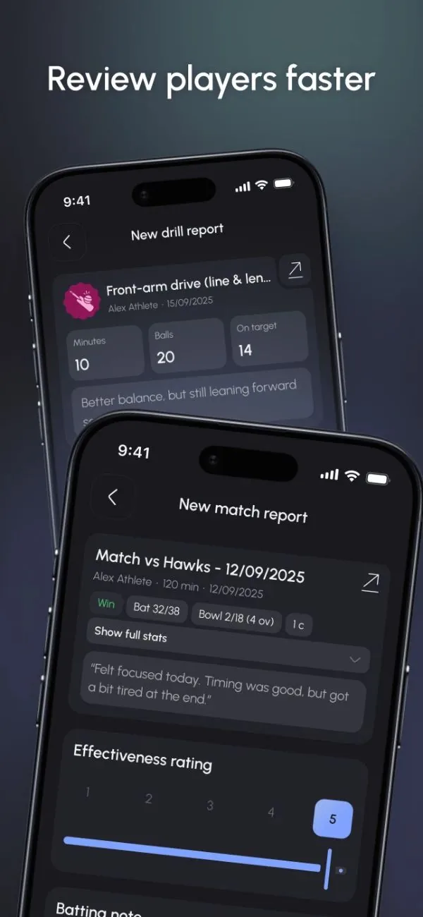
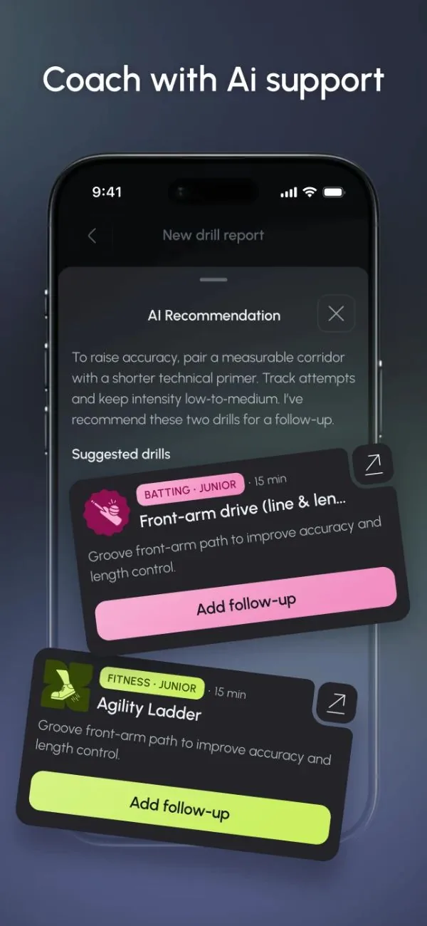
Every athlete logs sessions and matches. Coaches, or parents standing in as coaches, assign drills and write reports from those entries. An AI coach answers questions in between, which is the bet: the days from Tuesday practice to Saturday's game, when nobody is watching.
The client, a Cricket Australia-qualified coach, was our only domain expert and approved each decision as it was made.
What arrived
One desktop screen, Athlete Journal, held an entry form, performance charts, coaching advice and report cards at once. My first job was to find the product inside that list: which items were the same object, who each belonged to, and in what order a person moves through them.
Decision
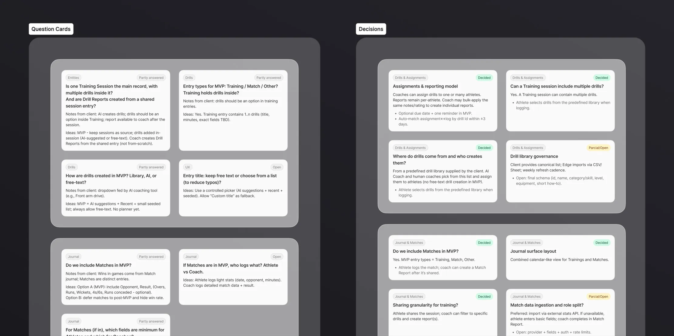
Open questions settled in writing before wireframes
Before wireframes, I built a board of open questions, tagged by area: entities, drills, journal, athlete–coach link, analytics, AI scope. Each had the client's notes and my proposal. Is a session the main record, with drills inside it? Who logs a match?
A second board held the same questions once settled, in the wording we'd build to.
Nobody asked me to do this. A decision that lives only in a call gets reopened; with the boards, the screens after them had written reasons.
The trade-off
Deciding in calls is faster and the usual practice, and the boards took most of a week before any wireframe. In return, settled questions stayed settled, and new team members caught up from the board.
Decision
Two modes on one account, without either crowding the other
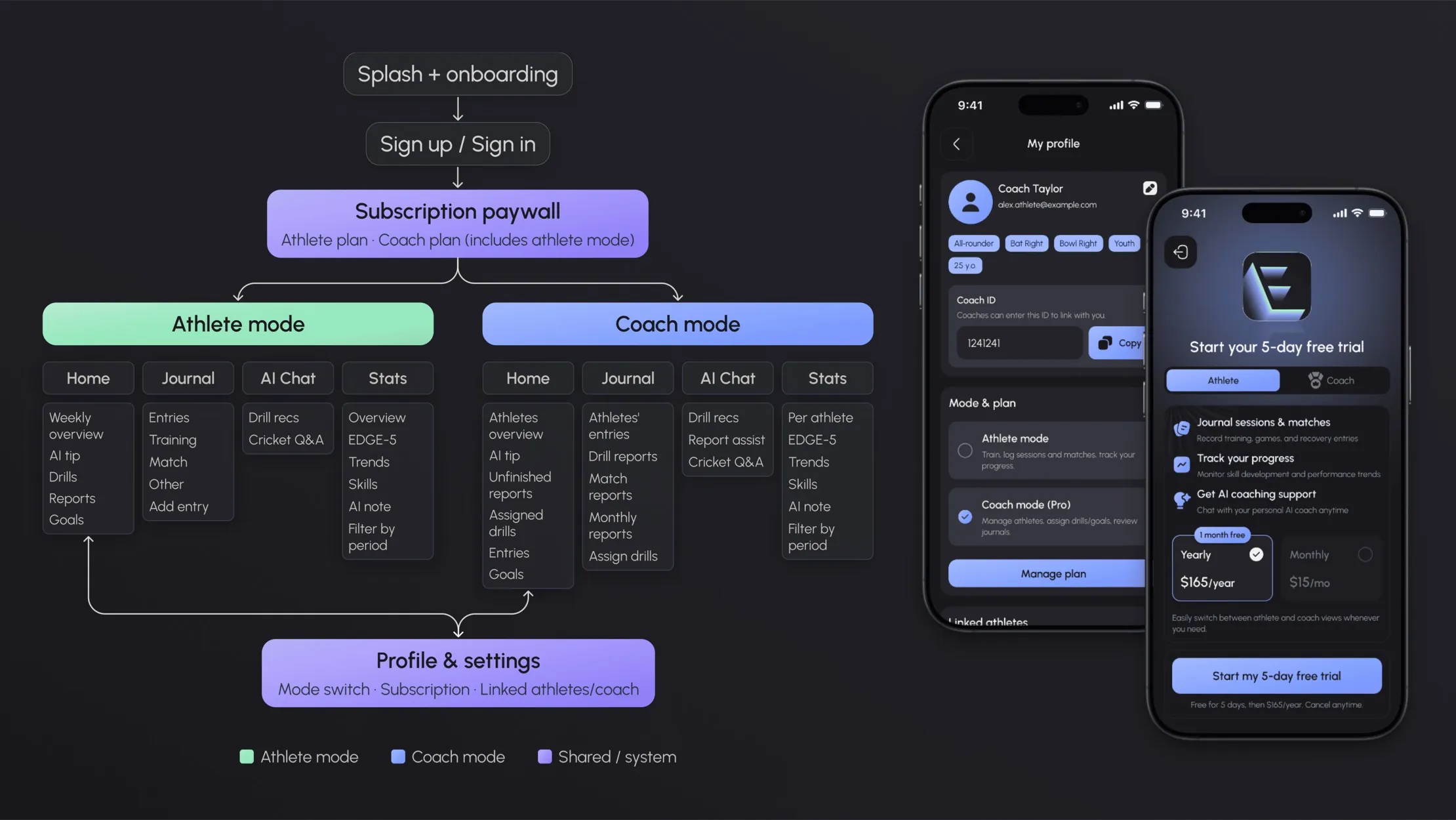
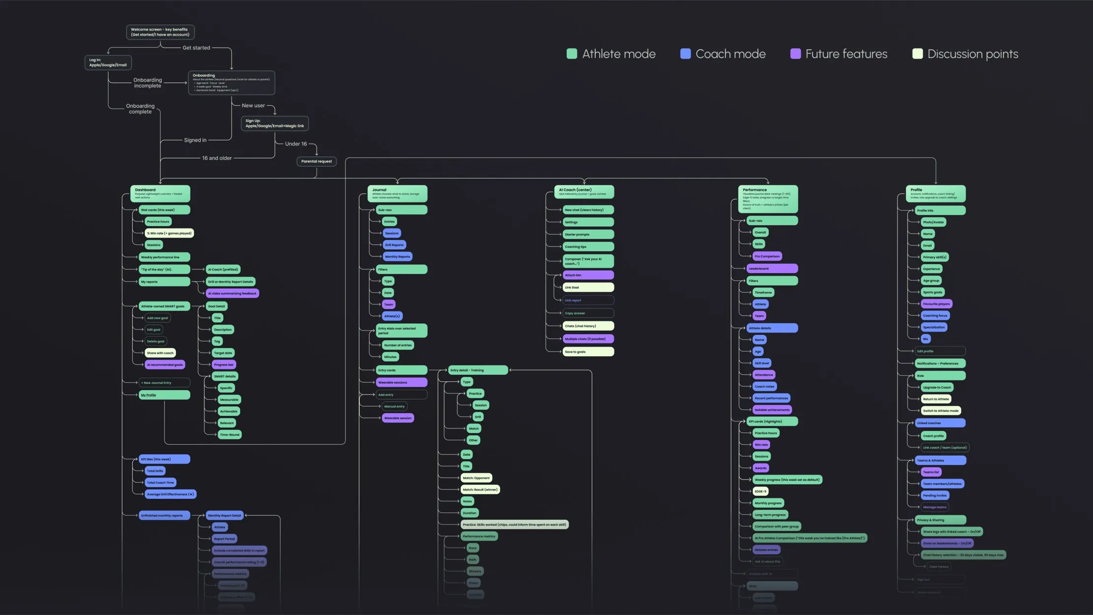
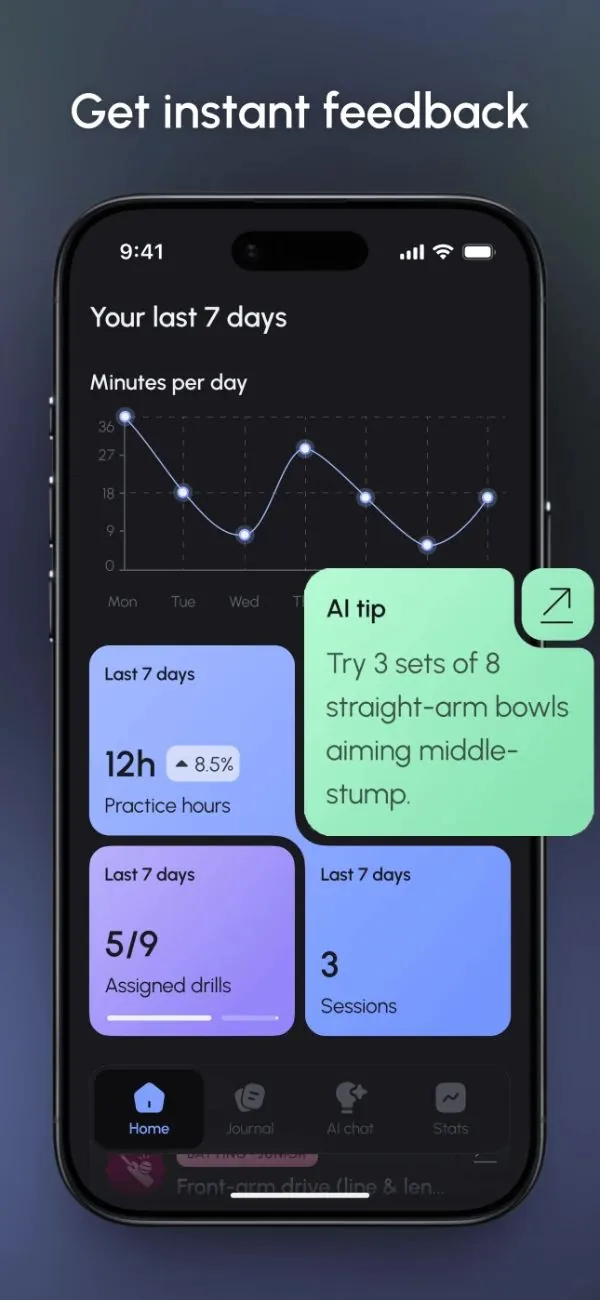
The same person is often both: a club coach still trains, and a parent with no cricket background ends up coaching a child. So both modes got the same four tabs (Home, Journal, AI Chat, Stats), pointed at yourself or at the people you coach.
The mode switch started as a header toggle. Two things moved it: the client put both modes behind a subscription, and a toggle on every screen is weight for every user, carried for the few who switch. It now sits in Profile & settings, next to the plan that governs it.
I hid the switch for junior athletes. A junior can't be a coach, and coach mode means managing other people's data.
The trade-off
The header toggle was one tap instead of four and showed both roles from anywhere. But once both modes sat behind a plan, the switch and the plan became one decision, so they share a screen.
Decision
One journal doing two jobs — and the split I'd make now
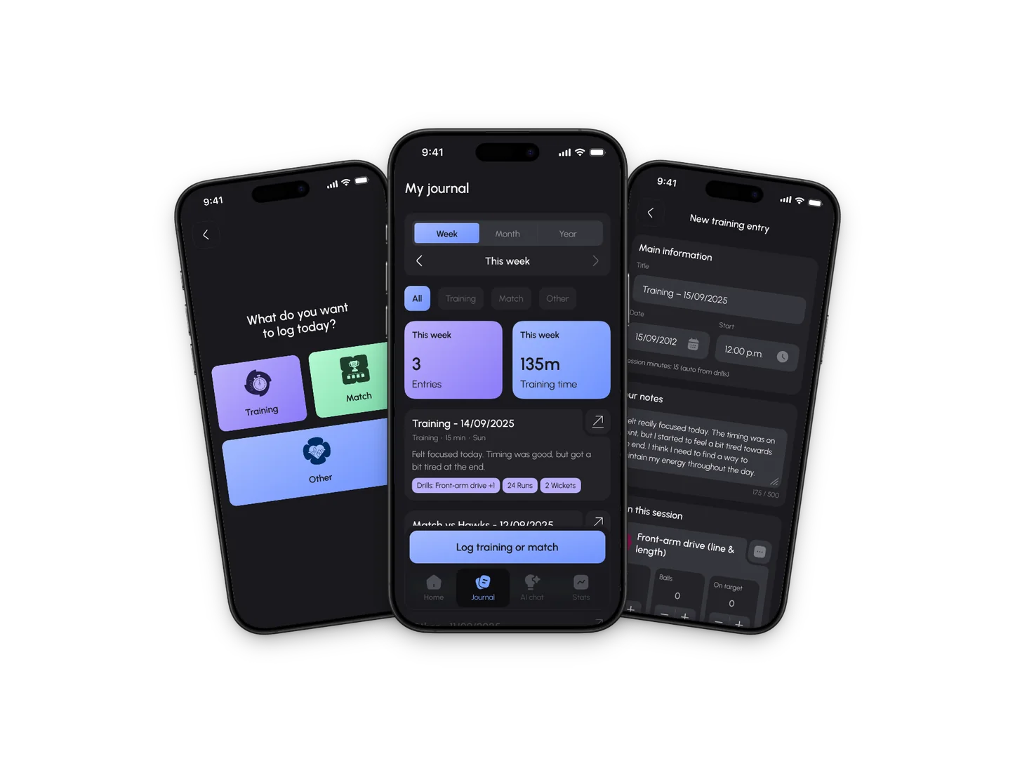
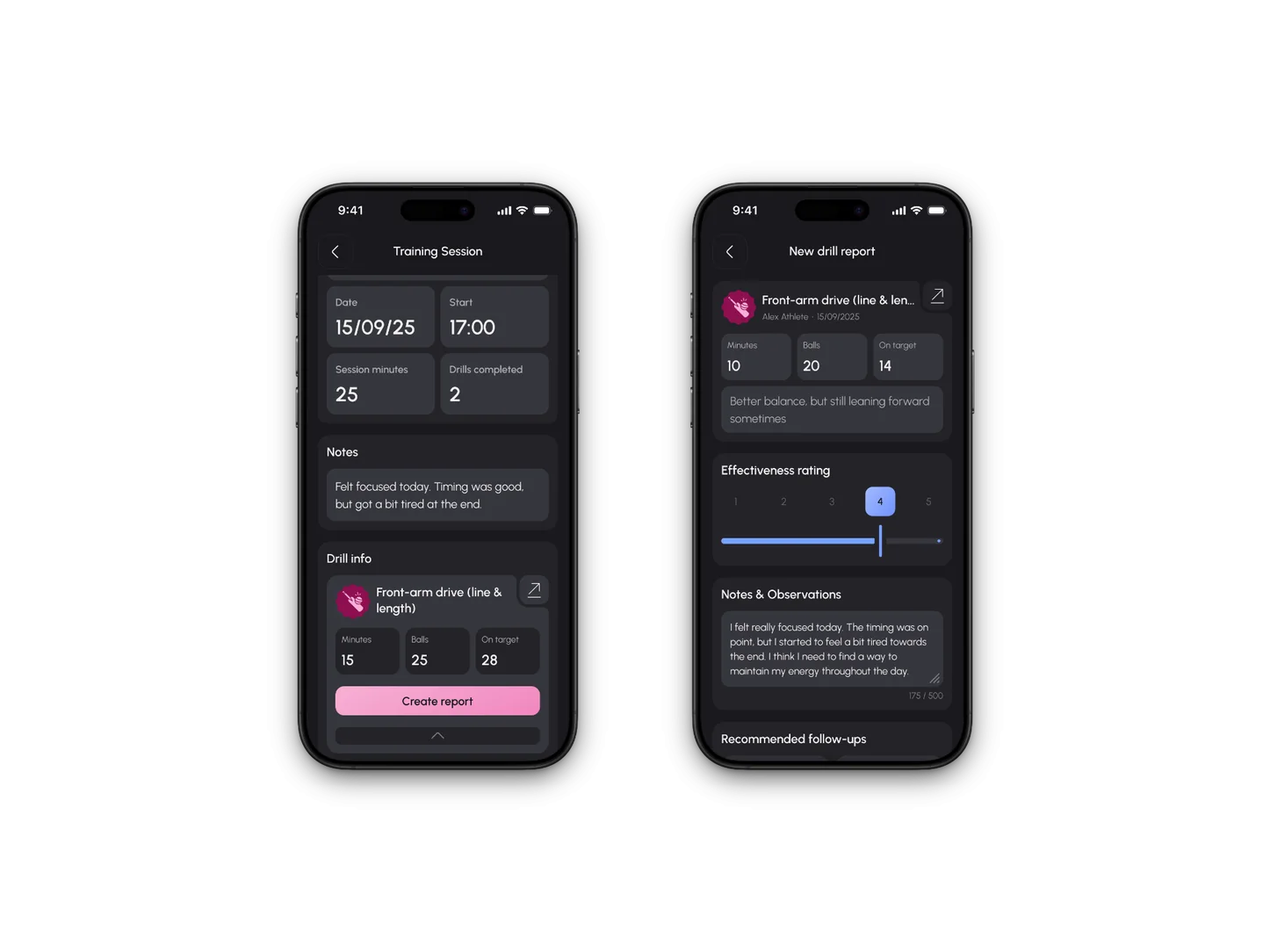
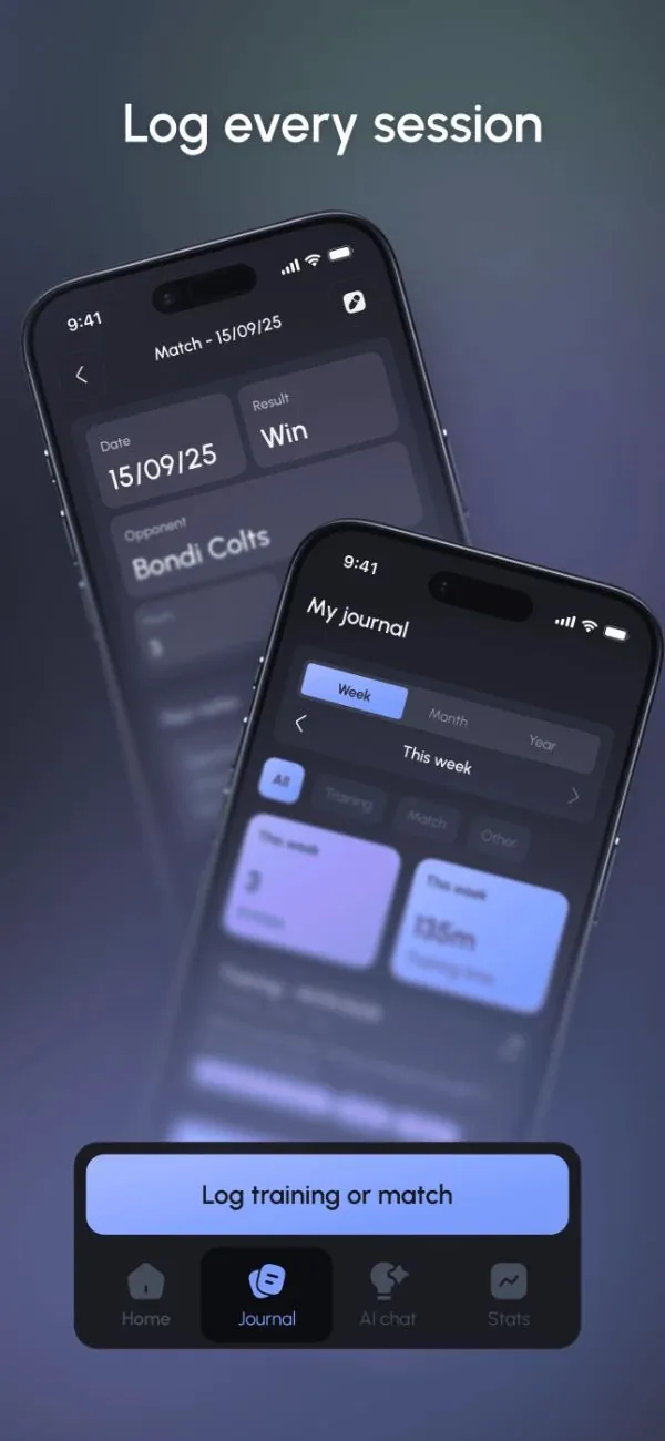
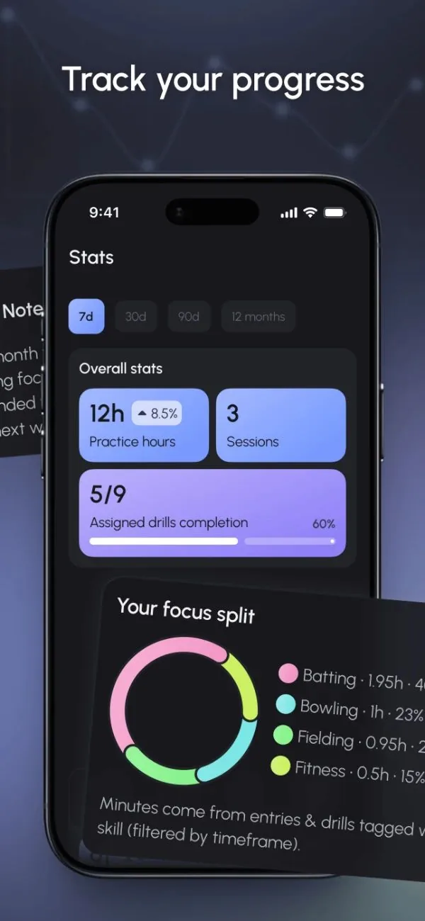
The hardest surface in the app. For the athlete it stayed simple: a week, month or year of entries, a filter by type, and a strip of stats for the period. Logging runs as its own flow.
The coach's version carries much more: a filter by athlete, their own stats, drill assignment, and four report sections alongside the athletes' entries.
I kept it as one tab because a coach's work starts inside the athlete's entry: you open a shared session and create the report from it. Splitting them would mean holding a session in your head while switching tabs.
I'd split it now anyway: one tab mirroring the athlete journal, one for the coach's own output, and a link from the entry to the report. The connection I was protecting is a navigation problem, and I solved it at the wrong level.
Still open
Four report sections and two filters are a lot for an empty state, and a coach's first week is exactly that.




Decision
Archetypes chosen before anything visual
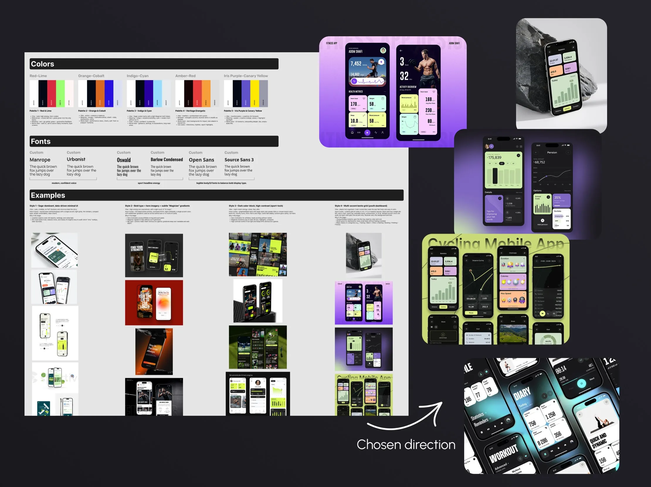
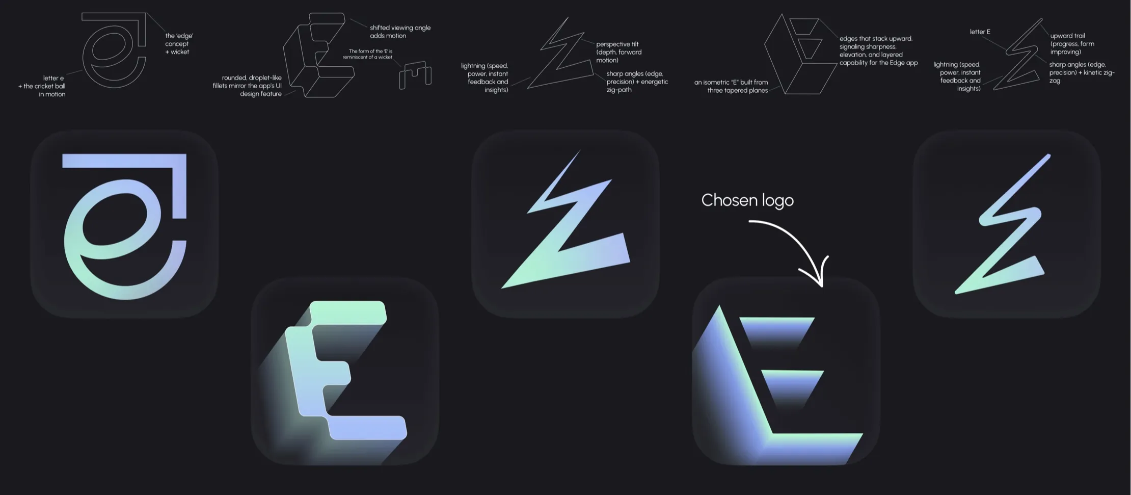
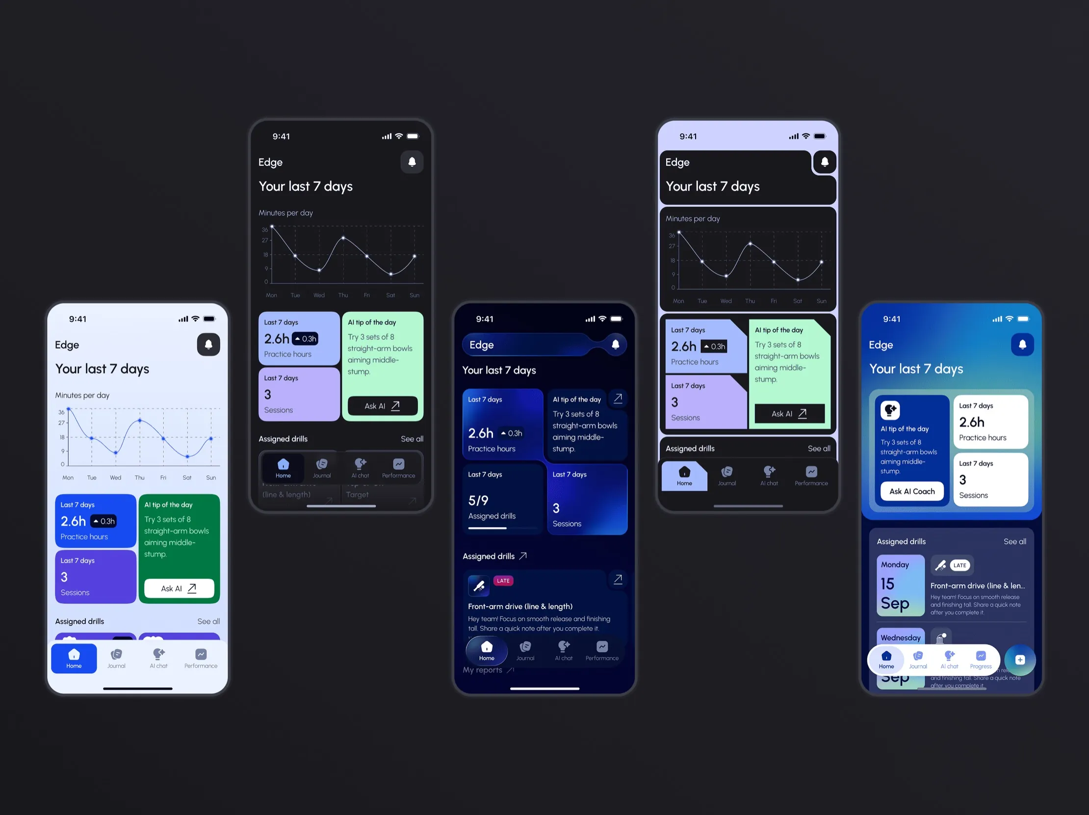
Before any moodboard, I set a formula: 60% Sage for reading your own progress, 30% Hero for sport, 10% Magician for the AI. The Magician ended up louder than 10%, rightly: the AI coach is what a parent without cricket knowledge leans on.
Each archetype had to show on screen. Sage gave the bento grid of comparable data blocks, Hero the high contrast and motion, Magician the deep colours and glow.
The client chose the bento direction, then picked a photo from my archetype presentation over every palette I proposed; the colours came from it.
Later, briefing the promo work, he sent no references. He asked for it to lean more Magician to catch attention: the framework had given him the words.
The trade-off
A formula is good for agreeing on feel and poor for predicting where you land. Shipping 25% Magician against a planned 10% is fine; treating the formula as a spec would not be.
The constraint
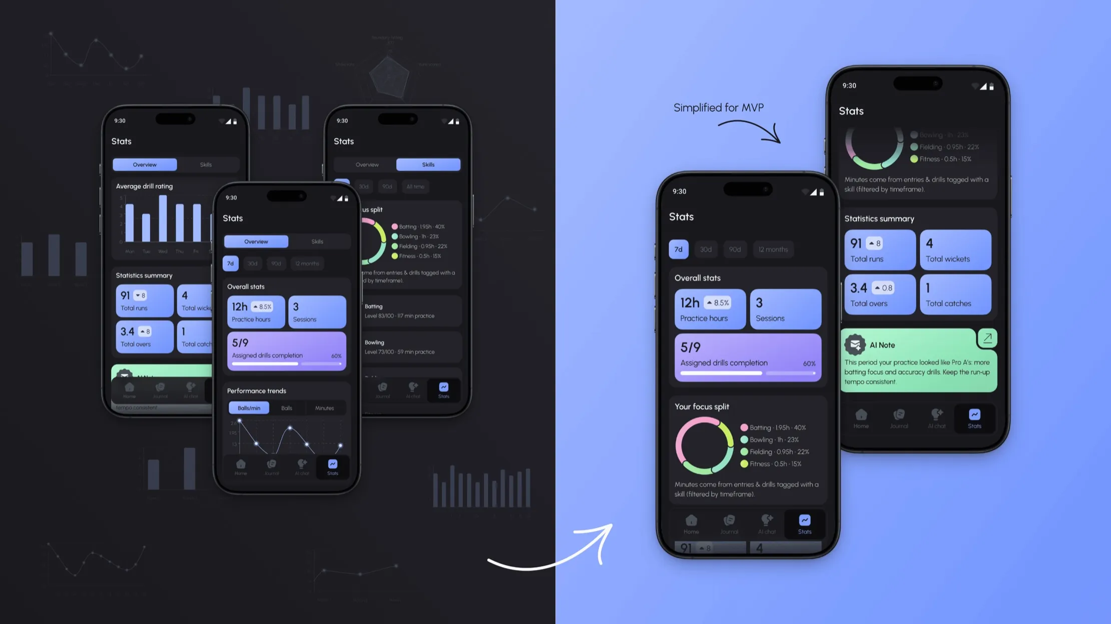
Half the stats tab moved to post-MVP after it was designed
Late on, a budget call cut the MVP scope, and I learned what was deferred after the screens were finished. The stats tab lost the most: the skill radar, the trends chart, the drill-rating chart and the Skills sub-tab.
My job was to make the reduced tab hold together: rebalance the grid, rewrite the empty states, and let the AI note carry the interpretation the charts used to.
At the retrospective, I raised the sequencing: designers should be in the room when scope moves, because they know what's load-bearing. The team agreed.
Decision
One film, two crops, and a page built to use both
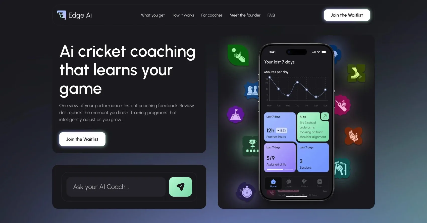
The film was going to LinkedIn and Instagram, which want different shapes. I flagged it early and proposed putting the film on the landing page too: landscape for desktop, portrait for mobile. We built both cuts.
I set the message direction, confirmed it with the client, and borrowed phrases he'd already tested on investors. Sixteen seconds, four beats, my script:
- 01 · Batting, cutting to the app loading
“Meet Edge — your personal AI coach.”
- 02 · A prompt being typed into the AI chat
“Ask your AI coach anything.”
- 03 · The coach answers with drills for the next session
“Instant. Intelligent. Individualized.”
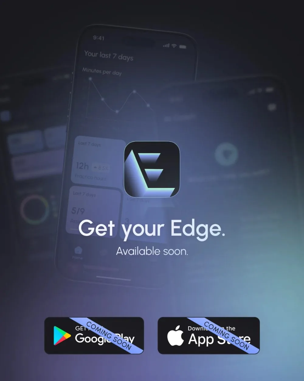
- 04 · Bat raised, logo, “coming soon”
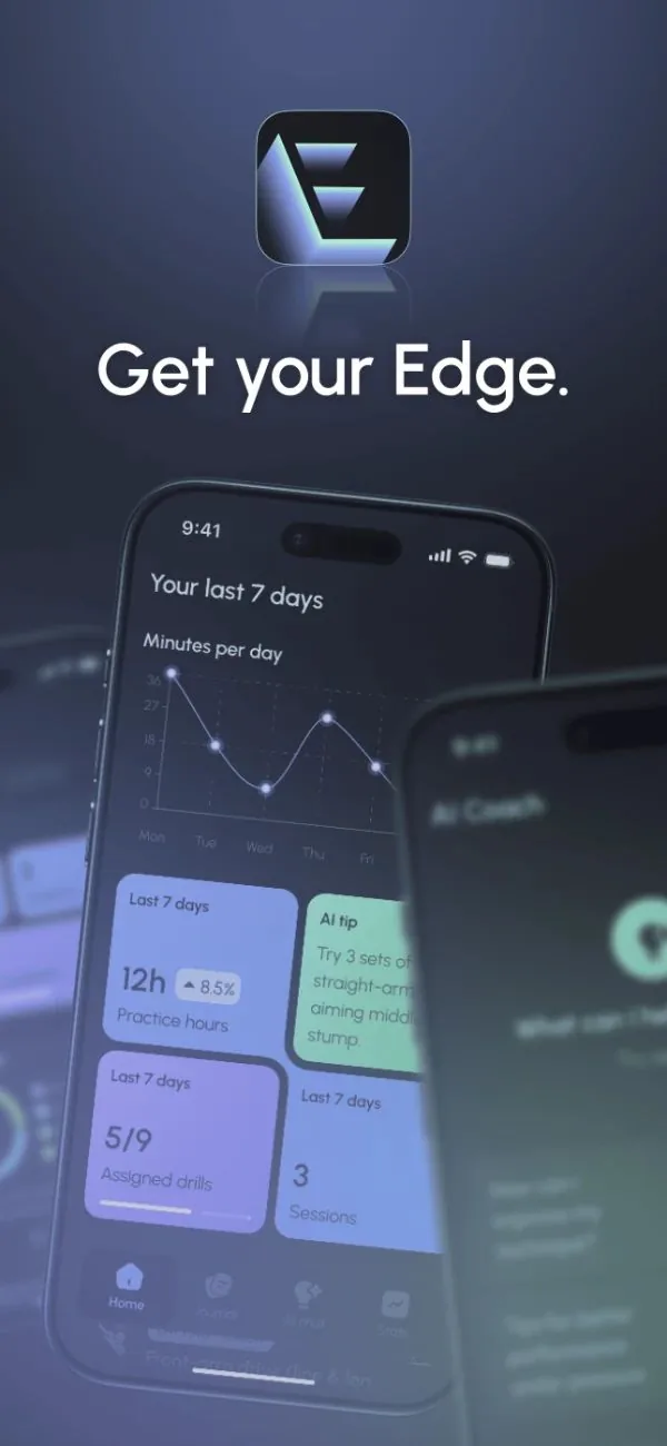
“Get your Edge.”
I storyboarded and animated both cuts. The page had one job: collect waitlist emails, mostly from the client's cricket network. I wrote its copy, with a lot of input from the client.
The trade-off
One landscape cut, cropped for vertical, costs a day less. Two real cuts meant the film worked as composed everywhere, and the page got its hero without a separate asset.
 edgeaicoaching
Sponsored
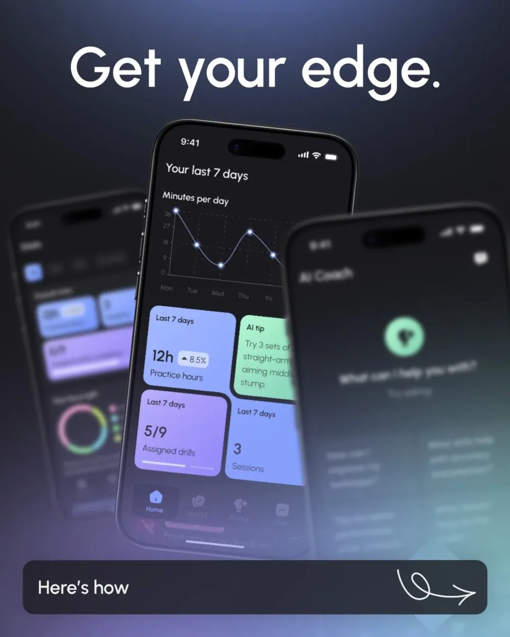
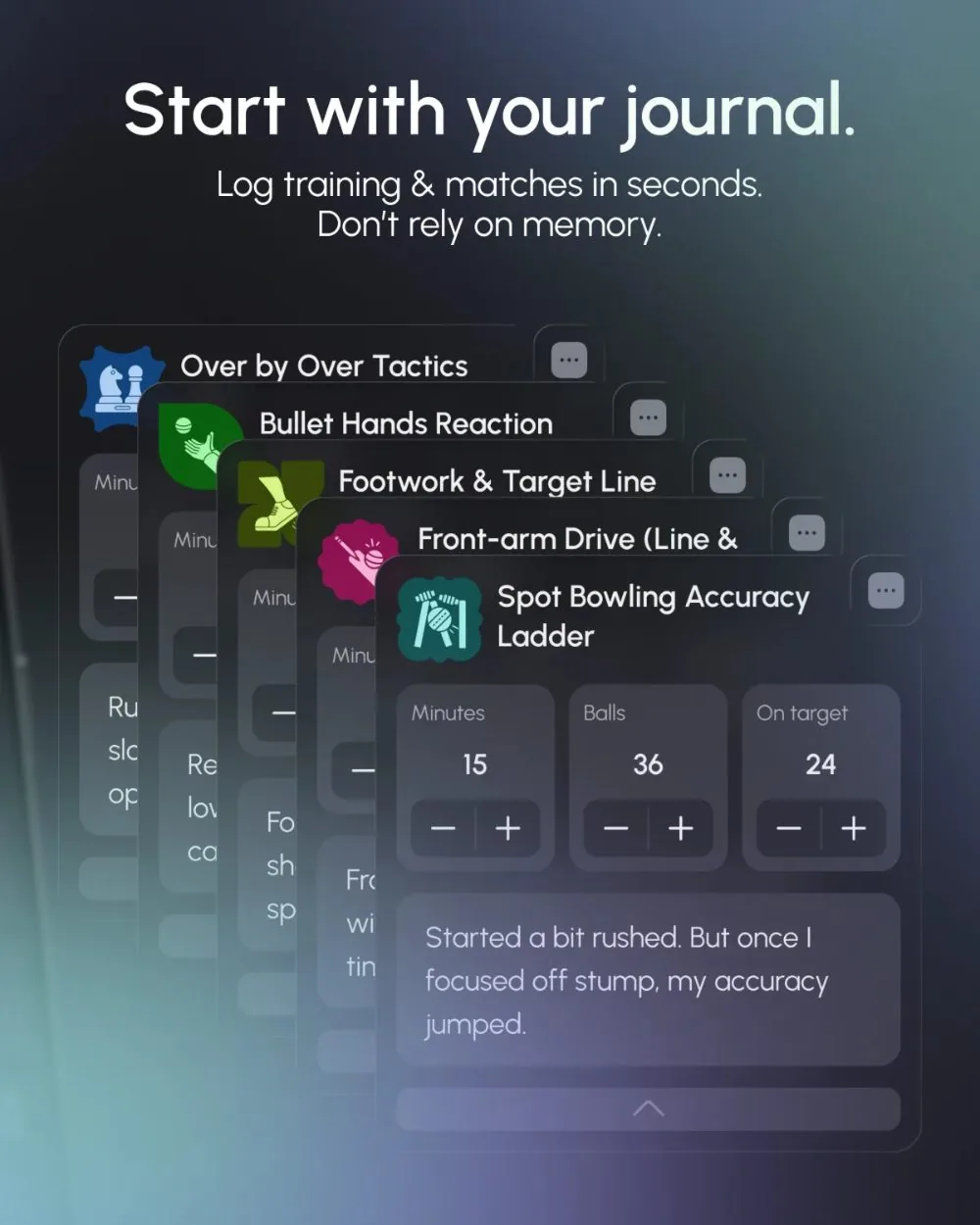
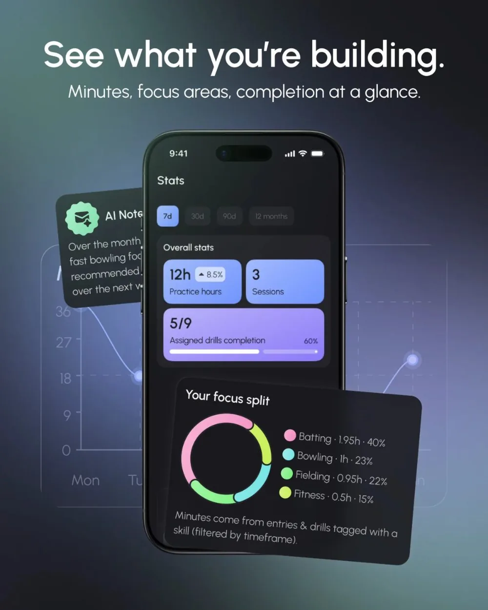
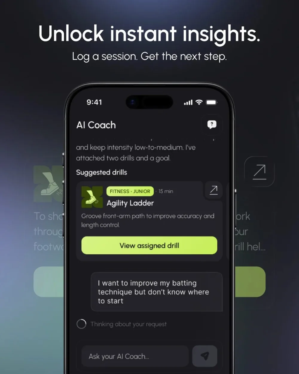
edgeaicoaching Ai cricket coaching that learns your game.
What happened
Edge AI reached both stores after I left the company, so I have no launch numbers and won't borrow any.
The client was happy with the design throughout and picked up the archetype vocabulary himself.
“Design system elements were reused well across the app — few one-off elements to build.”
The first users would have been the client's own athletes and friends. In their first fortnight I'd have watched two things: whether an athlete logs a second session unprompted, and whether a coach writes a report from a shared entry. The structure rests on those two.
What I'd carry forward
Press harder for the one thing the product can't exist without. I asked for the must-haves, but never forced the question of the single feature everything hangs off. Without that anchor, an MVP grows in every direction. It's the first conversation I'd book next time.
Build an hour of user contact into the plan: an athlete and a coach from outside the client's circle, with the wireframes. There was no research budget; next time I'd make the case for one.
Edge AI · AI cricket coaching app · iOS & Android
Sole designer · Sep 2025 – Jan 2026